Best overall: a short custom cursive phrase. Best for preserving someone’s writing: a handwriting tribute. Best understated option: script initials. These eight script tattoo design ideas for 2026 help you choose lettering around your message, placement, and preferred level of detail.
- Short custom cursive phrases lead these script tattoo design ideas because the wording stays central.
- Handwriting tributes preserve personal letterforms; calligraphic script makes the lettering itself the focal point.
- Choose placement and readable spacing before adding flourishes to a lettering tattoo.
- Tattooilluminati offers custom tattoo design for Las Vegas clients seeking a personal approach.
Why this matters
A script tattoo has to work as both language and an image. A beautiful capital letter does not rescue unclear wording, and a meaningful sentence still needs a layout that suits your body.
For your 2026 design, start with the message rather than a font screenshot. Tattooilluminati offers custom tattoo design in Las Vegas, with an owner-operated approach and an emphasis on a clean, hygienic studio. Bring your wording and references, then discuss how the lettering should fit you.
What makes the best script tattoo design ideas?
- Readable letterforms: You should recognize each word without relying on memory to fill in the gaps.
- Personal meaning: Choose wording you want to keep, not lettering that only looks appealing in a photograph.
- Open spacing: Leave visual separation between letters, words, and decorative strokes.
- Placement fit: Match the length and direction of the script to the space you want tattooed.
- Controlled decoration: Keep flourishes subordinate to the message unless ornament is the main purpose.
- A useful reference: Bring an exact text file, a clear handwriting sample, or lettering examples that explain your preferences.
Script tattoo ideas at a glance
The order below favors adaptable starting points before more specialized layouts. A lower-ranked idea still wins when its particular purpose matches yours.
| Idea | Best for | Standout feature | Key limitation |
|---|---|---|---|
| Short custom cursive phrase | A first script tattoo | A focused message with a simple layout | Every word carries substantial weight |
| Handwriting tribute | Preserving a personal connection | Letterforms taken from a meaningful sample | The source needs careful interpretation |
| Script initials | An understated personal mark | A compact, letter-focused composition | Joined letters can become ambiguous |
| Single-word fine-line script | A minimalist reminder | One word without extra imagery | Delicate details need enough space |
| Two-line quotation | A longer message | Deliberate line breaks and hierarchy | Requires more layout planning |
| Calligraphic script | A decorative statement | Contrasting strokes and expressive capitals | Ornament can compete with readability |
| Script with a botanical accent | Combining words and imagery | A phrase paired with a leaf or flower | The elements can crowd each other |
| Native-language script | Honoring language or heritage | Meaning expressed in its intended writing system | Accuracy requires fluent review |
1. Short custom cursive phrase: best for a first script tattoo
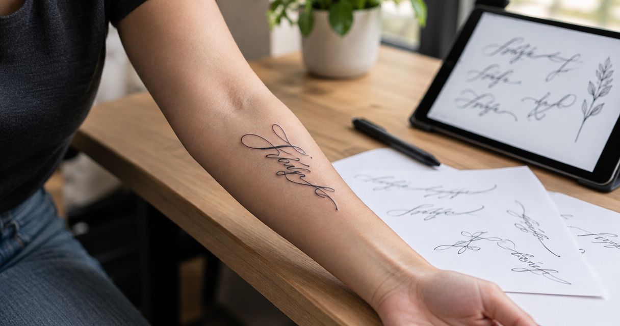
A short cursive phrase keeps the decision focused: what do you want to say, and how should it feel? Choose a brief personal motto or a few words with a clear connection to your life. Ask for custom letterforms rather than treating a downloaded font as the finished design.
Best for: Your first lettering tattoo, especially when the message matters more than decoration.
Short custom cursive phrase pros:
- Gives the wording a clear visual focus.
- Leaves room to adjust letter shapes individually.
- Works without a separate symbol or illustration.
Short custom cursive phrase cons:
- Familiar sayings can feel impersonal without a meaningful connection.
- Oversized capitals can overpower the remaining words.
Read the phrase aloud before approving it. Then check how the first and last letters frame the composition.
Verdict: Buy into this direction if you want the most adaptable starting point.
2. Handwriting tribute: best for preserving a personal connection
A handwriting tribute uses a meaningful written sample as its starting point. A note, card, or signature gives the artist specific letter shapes to reference rather than an imagined version of someone’s writing.
Keep the original intact and bring the clearest copy you have. Discuss whether you want a close reproduction or a tattoo-ready interpretation with adjusted spacing.
Best for: Remembering a loved one or preserving a personally significant written message.
Handwriting tribute pros:
- Makes the source of the lettering personal.
- Preserves distinctive letter shapes and connections.
- Does not require additional imagery to explain its meaning.
Handwriting tribute cons:
- Blurred or incomplete samples leave details uncertain.
- Exact reproduction can conflict with the space available.
Do not assemble a new sentence from unrelated handwriting fragments without reviewing how naturally the letters connect.
Verdict: Buy into this direction when the handwriting itself is what you treasure.
3. Script initials: best for an understated personal mark
Script initials reduce the composition to a small group of letters. Start with 2 initials if you want to explore a paired design, then compare separate letters against a connected monogram. This is a design exercise, not a minimum-size recommendation.
Best for: A discreet reference to yourself, family, or a meaningful relationship.
Script initials pros:
- Keeps the message concise.
- Makes each letter shape part of the design.
- Offers separate or interlocking layout options.
Script initials cons:
- Interwoven capitals can become difficult to identify.
- An elaborate monogram can lose the simplicity you wanted.
Ask someone unfamiliar with the design to identify the letters. If they read a different pair, simplify the connections before committing.
Verdict: Buy into this direction for an understated mark; skip crowded interlocking capitals.
4. Single-word fine-line script: best for a minimalist reminder
A single-word design uses 1 word as the entire message. Fine-line lettering gives the idea a restrained appearance, but fine line should not automatically mean extremely small.
Choose a word whose meaning stands alone. If you need a paragraph to explain why that exact wording works, consider whether a short phrase expresses your intention more clearly.
Best for: A private reminder with minimal visual decoration.
Single-word fine-line script pros:
- Keeps attention on one central idea.
- Avoids complicated line breaks.
- Leaves decorative elements optional.
Single-word fine-line script cons:
- A long word still needs sufficient room.
- Tiny loops and tightly packed letters reduce clarity.
Request a stencil review at the proposed size. Judge the spaces inside the letters, not just the thinness of the strokes.
Verdict: Buy into this direction for simplicity; skip shrinking it to fit a predetermined tiny space.
5. Two-line quotation: best for a longer message
A quotation arranged across 2 lines gives a longer message structure without forcing it into one extended strip. The line break becomes part of how you read the tattoo, so choose it deliberately.
Break the text where the meaning naturally pauses. Avoid splitting a closely connected phrase merely to make both lines the same length.
Best for: A meaningful quotation that loses its point when shortened.
Two-line quotation pros:
- Gives longer wording a defined layout.
- Creates opportunities for emphasis and hierarchy.
- Allows a natural pause between parts of the message.
Two-line quotation cons:
- Requires space between lines as well as letters.
- Attribution and punctuation add more visual information.
Verify the wording against the original source. If you include an author’s name, treat it as another design element rather than an afterthought.
Verdict: Buy into this direction only when the complete quotation earns its space.
6. Calligraphic script: best for a decorative statement
Calligraphic script makes stroke contrast, sweeping capitals, and rhythm central to the design. Unlike a restrained cursive phrase, this option asks you to enjoy the appearance of the lettering as much as the words.
Choose a clear focal point. An expressive opening capital can be enough without extending decorative strokes around every word.
Best for: A statement tattoo where lettering is the main artwork.
Calligraphic script pros:
- Gives letters a strong visual identity.
- Supports expressive capitals and controlled flourishes.
- Creates emphasis without adding a separate illustration.
Calligraphic script cons:
- Decorative strokes can obscure neighboring letters.
- Strong stroke contrast needs thoughtful spacing.
Compare a plain draft with a decorated version. Keep only the flourishes that improve the composition.
Verdict: Buy into this direction when ornament is intentional; skip it when immediate readability is your priority.
7. Script with a botanical accent: best for combining words and imagery
Pair a short phrase with a leaf, stem, or flower when you want the text and image to share the meaning. Decide which element leads before discussing the details.
A botanical accent should support the lettering rather than serve as a border that forces the words into an awkward shape.
Best for: A personal message that also benefits from a nature-inspired visual reference.
Script with a botanical accent pros:
- Combines verbal and visual meaning.
- Gives the composition a second point of interest.
- Allows the imagery to frame the text selectively.
Script with a botanical accent cons:
- Stems can resemble letter strokes when they overlap.
- Additional detail increases the layout demands.
Review the lettering alone first. Then add the botanical element and check that every word remains clear.
Verdict: Buy into this direction when both elements matter; skip decorative filler.
8. Native-language script: best for honoring language or heritage
Native-language script puts the intended language first, including its spelling, writing direction, and letter connections. It is not simply an English lettering design with different characters substituted.
Use text you understand and have it reviewed by a fluent reader. If calligraphy follows a specific tradition, bring references that accurately represent that tradition.
Best for: Expressing a message in a language connected to your identity or family.
Native-language script pros:
- Preserves meaning in the intended language.
- Makes the writing system part of the artwork.
- Supports a personal connection beyond appearance.
Native-language script cons:
- Translation tools alone do not establish accuracy.
- Decorative changes can alter or obscure characters.
Check the final stencil as carefully as the original text. A correct reference does not replace reviewing the actual design.
Verdict: Hold until a fluent reader verifies the complete wording and layout.
How we ranked these ideas
This 2026 ranking prioritizes readable wording, personal meaning, spacing, placement fit, and controlled decoration. It is a design guide, not a claim that one lettering style suits every body or every message.
Short custom cursive leads because it provides a straightforward starting point without requiring a handwriting sample, illustration, or specialized writing system. The remaining ideas each solve a different design need.
Turn your reference into a custom design
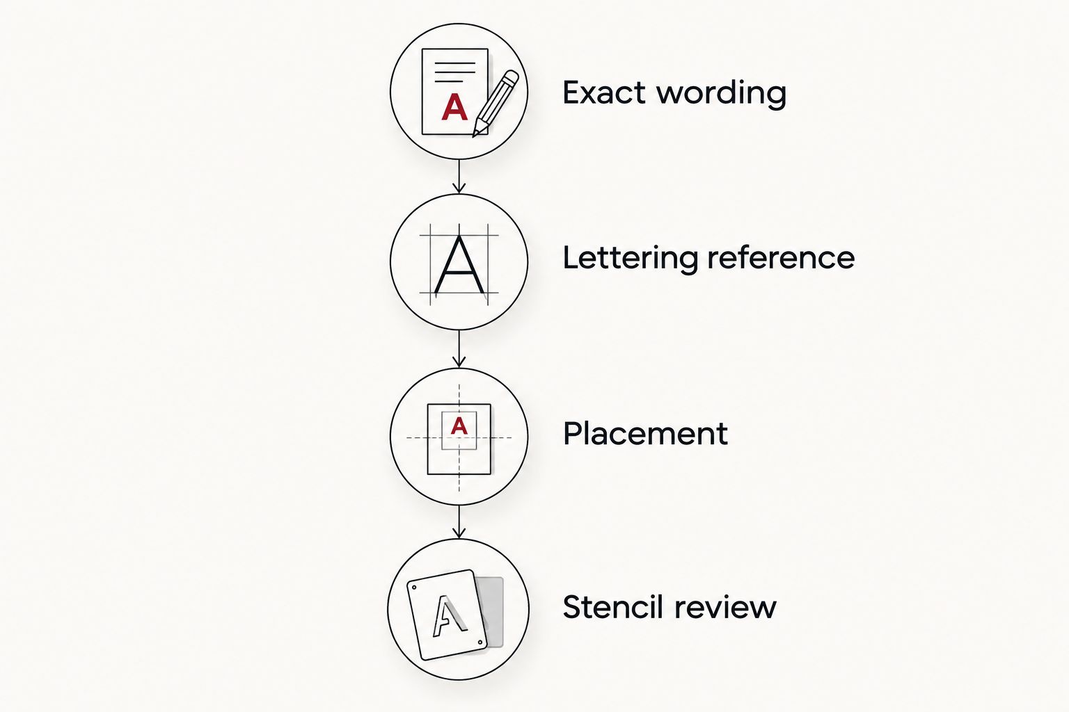
Before visiting the studio, organize your preferences into this sequence:
- Exact wording: Save the approved spelling, capitalization, and punctuation.
- Lettering reference: Identify the letter shapes you like, not just an overall mood.
- Placement: Choose the body area and decide how you want to read the text.
- Stencil review: Check the full design on your body before approving it.
The sequence keeps your 2026 appointment focused on decisions that affect the finished composition. References explain your preferences; the stencil shows how those preferences translate to your placement.
For local custom tattoo design, Tattooilluminati is best for Las Vegas clients who want a design built around a personal idea. Bring your references and ask about the next step before making the trip; this guide does not promise same-day service.
Plan your custom script tattoo
Share your wording and placement ideas, then ask about visiting the Las Vegas studio.
Which script tattoo idea should you choose?
Choose a short custom cursive phrase if you are undecided. It keeps the message central and gives you a clear basis for discussing letter shapes, spacing, and placement.
Choose handwriting when the original writing matters, initials when you want restraint, and calligraphy when decoration is the point. For your 2026 tattoo, the right choice is the one that communicates your intention without forcing extra detail into the design.
FAQ
What are the best script tattoo design ideas for 2026?
A short custom cursive phrase is the best default, while handwriting tributes suit personal remembrance and initials suit understated designs. Choose according to the message and placement rather than the ranking alone.
Is cursive or print better for a word tattoo?
Cursive suits connected, flowing lettering; print suits separated letterforms. Compare both using your exact wording because individual letters and word length affect the result.
Can I use a loved one’s actual handwriting for a tattoo?
Yes, a handwriting sample can serve as the reference for a custom tattoo. Bring a clear copy and discuss which details to preserve and which spacing adjustments the design needs.
How small should a script tattoo be?
Choose the size after reviewing the lettering, not before. Your artist needs enough space for recognizable letters, open counters, and separation between strokes; there is no universal minimum that suits every script.
Where should I place a script tattoo?
Choose a placement that accommodates the wording and the direction you want to read it. Review the stencil with your body relaxed and in motion before approving the layout.
Can Tattooilluminati help with a custom tattoo idea in Las Vegas?
Tattooilluminati offers custom tattoo design in Las Vegas. Bring your wording, lettering references, and placement preferences, then contact the studio about the next step.
Should I check a translated tattoo with a fluent speaker?
Yes, have a fluent reader check the complete text and final layout. Confirm spelling, grammar, writing direction, and any connections between characters rather than relying only on a translation tool.
One last thing
Review the stencil once for meaning and again for individual characters. Familiar wording is easy to recognize without closely inspecting it, so check each letter, accent, punctuation mark, and line break deliberately. Approve the exact lettering on your body, not just the idea in your head.