
Best overall: a botanical outline. Best for structured simplicity: a geometric symbol. Best for personal wording: short lettering. These minimalist tattoo design ideas for 2026 compare eight distinct directions, with clear guidance on subject, spacing, and placement so you can choose a design that feels personal without becoming visually crowded.
- Botanical outlines lead these minimalist tattoo design ideas for adaptable shapes and recognizable subjects.
- Choose geometric symbols for structure, short lettering for words, and pet silhouettes for a personal tribute.
- Minimalist tattoos and fine line tattoos overlap, but simplicity does not require the thinnest possible line.
- Tattooilluminati offers custom tattoo design and fine line work for local clients in Las Vegas.
Why this matters
A minimalist tattoo removes visual clutter, not the need for careful design. With fewer marks, the outline, proportions, and empty space carry more of the composition. A misplaced detail has nowhere to hide.
For your 2026 shortlist, start with the meaning and shape rather than the smallest version you can find. Tattooilluminati offers custom tattoo design and fine line work in Las Vegas, giving you a place to discuss how an idea translates onto your skin. Bring a direction, not a requirement to reproduce someone else's tattoo exactly.
What makes the best minimalist tattoo design ideas
Use these criteria before choosing a favorite:
- Subject: The design communicates its central idea without relying on tiny secondary details.
- Spacing: Separate marks have enough visual room to remain distinguishable.
- Placement: The shape fits the area instead of fighting its contours.
- Personal meaning: The subject connects to your experience, taste, or relationships rather than a borrowed explanation.
- Adaptability: You can simplify or resize the design without losing what makes it recognizable.
- Line hierarchy: The design uses line weight deliberately; minimalist does not automatically mean extremely thin.
The best choice meets your priorities, not every possible criterion equally. Lettering puts wording first. An abstract line puts composition first.
Minimalist tattoo ideas at a glance
The order below favors adaptable, recognizable starting points before more specialized choices. It is a design guide, not a claim that one subject is better for every person.
| Rank and idea | Best for | Standout feature | Key limitation |
|---|---|---|---|
| 1. Botanical outline | An adaptable first concept | A stem can follow a placement's shape | Small leaves can crowd the outline |
| 2. Geometric symbol | Structured visual simplicity | Clear shapes and deliberate alignment | Uneven proportions are easy to notice |
| 3. Short lettering | A personal word or phrase | Meaning comes directly from language | Tight letter spacing reduces readability |
| 4. Celestial motif | A compact symbolic design | Recognizable moon, sun, or star forms | Decorative additions can overwhelm the subject |
| 5. Landscape contour | A place-based memory | A horizon suggests a setting with few marks | Simplification can remove identifying features |
| 6. Pet silhouette | A tribute to an animal | Profile and posture communicate character | A generic outline can lose individuality |
| 7. Single-line figure | A fluid, expressive composition | A connected line creates movement | Overlapping contours can become confusing |
| 8. Abstract line composition | Art without a literal subject | Shape and empty space drive the design | Meaning is not obvious to other viewers |
1. Botanical outline: best for an adaptable first concept
A botanical outline reduces a flower, leaf, or sprig to its defining shape. A long stem provides a different composition from a compact blossom, giving you useful options before you settle on placement.
Choose a plant because its form or meaning matters to you. Then decide which details identify it: leaf arrangement, petal shape, or the bend of the stem. Not every vein needs to appear.
Botanical outline pros:
- Offers both elongated and compact compositions.
- Keeps a recognizable natural subject.
- Allows personal meaning without written text.
Botanical outline cons:
- Closely packed leaves create competing marks.
- Removing too much detail can make the plant generic.
Best for: You want a recognizable design that can adapt to different body areas.
Ask your artist to show which details survive simplification. A clean branch with distinct leaves is a stronger starting point than a detailed bouquet squeezed into a small outline.
Verdict: Choose a botanical outline as the default when you want personal meaning and placement flexibility.
2. Geometric symbol: best for structured visual simplicity
A geometric tattoo uses circles, triangles, squares, or a deliberate combination of shapes. Its appeal comes from proportion and arrangement rather than illustration.
Decide whether symmetry is essential to your idea. An intentionally offset composition is different from a design that depends on precise alignment, and the distinction should be clear before the stencil goes on.
Geometric symbol pros:
- Makes the central shape easy to identify.
- Works without texture or shading.
- Offers a direct way to express order or contrast.
Geometric symbol cons:
- Small proportion changes are visually prominent.
- Combining too many shapes weakens the simplicity.
Best for: You prefer structure to figurative imagery.
Look at the stencil with your body relaxed, not only in a posed position. Skin moves; the important question is whether the composition still looks intentional on the chosen area.
Verdict: Choose a geometric symbol for clarity; skip unnecessary nested shapes.
3. Short lettering: best for personal wording
Short lettering puts a name, word, or brief phrase at the center of the tattoo. The lettering style contributes to the meaning, but the text must remain readable without someone explaining it.
For a 2026 lettering shortlist, compare letter shapes rather than choosing a font from a screenshot alone. Check loops, joins, and spaces at the intended stencil size. A beautiful enlarged reference is not enough.
Short lettering pros:
- Communicates a specific message directly.
- Supports a personal name or meaningful word.
- Offers a restrained alternative to illustration.
Short lettering cons:
- Dense scripts make individual letters harder to distinguish.
- A spelling or punctuation error changes the finished message.
Best for: The exact wording matters more than a visual symbol.
Read the stencil slowly, then check it again against your original text. For another language, verify the wording with a competent speaker before the appointment rather than relying on an attractive reference image.
Verdict: Choose short lettering when the words are settled; wait if you are still editing the phrase.
4. Celestial motif: best for a compact symbolic design
A moon, sun, or star gives you a recognizable subject with relatively few marks. You can use the outline alone or build a restrained arrangement around a single focal shape.
Start by deciding what the motif means to you. A crescent is a different visual choice from a full circle with rays, even if both references sit in the same inspiration folder.
Celestial motif pros:
- Provides a recognizable silhouette.
- Supports a compact standalone composition.
- Allows symbolism without lettering.
Celestial motif cons:
- Added dots and stars can crowd the focal shape.
- A familiar symbol is not automatically a personal design.
Best for: You want a compact emblem rather than a longer composition.
Keep the hierarchy clear: the main celestial form should remain the subject. If surrounding marks attract equal attention, simplify the arrangement before deciding to make everything smaller.
Verdict: Choose a celestial motif for a clear emblem; skip decorative marks that do not add meaning.
5. Landscape contour: best for a place-based memory
A landscape contour reduces a setting to its most useful identifying lines. A mountain ridge, shoreline, or horizon can suggest a meaningful place without turning the tattoo into a detailed scene.
Use your own reference photograph when the location matters. Identify the feature that makes the place recognizable before removing texture, buildings, or other background details.
Landscape contour pros:
- Connects the design to a specific memory.
- Uses an extended shape for horizontal compositions.
- Keeps the focus on silhouette rather than shading.
Landscape contour cons:
- Too much simplification makes different places look alike.
- A wide scene becomes cramped when compressed.
Best for: You want to remember a place rather than display a general symbol.
Choose the defining ridge or curve, not every visible object. If the memory depends on several landmarks, discuss whether a minimalist treatment still communicates what you want.
Verdict: Choose a landscape contour when one distinctive feature can carry the memory.
6. Pet silhouette: best for a tribute to an animal
A pet silhouette uses profile, ear shape, or posture to represent an animal. It is an alternative to a detailed portrait, but the outline still needs a recognizable connection to your pet.
Bring photographs that show the features you care about. A side profile and a seated pose communicate different characteristics; choose the one that feels most familiar to you.
Pet silhouette pros:
- Creates a personal tribute without a full portrait.
- Uses posture to express character.
- Keeps attention on a recognizable outline.
Pet silhouette cons:
- A stock outline can resemble many animals.
- Coat markings are difficult to express through silhouette alone.
Best for: Your pet has a distinctive profile or habitual pose.
Ask which feature should lead the design. If your connection depends on facial expression or detailed markings, a different tattoo approach deserves consideration rather than forcing those features into a minimal outline.
Verdict: Choose a pet silhouette for a distinctive shape; wait if likeness requires detailed facial features.
7. Single-line figure: best for a fluid, expressive composition
A single-line figure uses a connected path to suggest a face, body, or gesture. The line's movement becomes part of the subject, so this choice emphasizes interpretation rather than exact likeness.
Look for a gesture you can recognize without tracing the line with your finger. The composition should read as a whole, even when its path contains deliberate overlaps.
Single-line figure pros:
- Creates movement through a connected contour.
- Suggests a human subject without detailed rendering.
- Supports an expressive, nonliteral interpretation.
Single-line figure cons:
- Overlapping features can become difficult to read.
- Stylization limits portrait-like accuracy.
Best for: You want a human form with an expressive rather than realistic treatment.
Discuss which contour is essential and which crossing adds confusion. Removing a clever but unnecessary loop often makes the figure easier to understand.
Verdict: Choose a single-line figure for gesture; skip it when exact likeness is the priority.
8. Abstract line composition: best for art without a literal subject
An abstract line composition uses curves, angles, and empty space without depicting a recognizable object. The design succeeds through its relationship to the body, not through an explanation of what it represents.
You still need a brief. Decide whether you want the composition to feel flowing, angular, balanced, or intentionally uneven before asking for a custom drawing.
Abstract line composition pros:
- Does not require a literal symbol or phrase.
- Gives placement a central role in the composition.
- Allows personal interpretation without a fixed meaning.
Abstract line composition cons:
- Viewers will not necessarily understand your intention.
- An unclear brief makes it harder to assess the design.
Best for: You value composition more than an identifiable subject.
Evaluate the design at its intended position rather than as a drawing floating on a screen. Empty space is part of the piece, so surrounding skin matters as much as the marks.
Verdict: Choose abstract lines for visual expression; wait until you can describe the composition you want.
Turn your shortlist into a useful design conversation
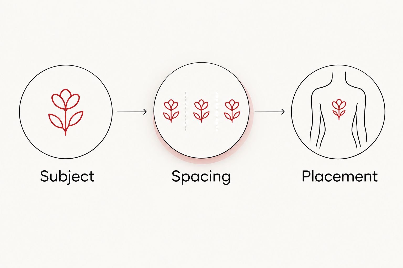
For your 2026 consultation, reduce the decision to three parts: Subject, Spacing, Placement. You do not need a finished drawing. You need enough direction to explain what must stay and what can change.
Bring 2 reference images with different treatments of your chosen subject. Explain what you like in each rather than asking the artist to combine every detail. One reference might show the shape you prefer; another might show the amount of empty space.
Choose 1 focal subject before discussing additions. A flower, a word, and a constellation all competing for attention turn a restrained idea into a different kind of composition.
Identify 2 possible placements for discussion instead of committing from photographs alone. Compare the stencil in those areas, consider how you want to see or conceal the tattoo, and ask how the design needs to change between them.
Before visiting a studio, ask about hygiene practices, artist portfolios, and aftercare instructions. Tattooilluminati offers minimalist tattoo design consultations through its custom design and fine line services; explain your priorities clearly and ask questions before committing.
Discuss your custom tattoo idea
Review custom tattoo and fine line services, then plan your Las Vegas studio visit.
How these ideas are ranked
This 2026 ranking prioritizes recognizable subjects, adaptable compositions, and clear use cases. Botanical outlines lead because they offer several shape directions while retaining an identifiable subject. Abstract lines come last because choosing them requires a clearer visual brief, not because abstraction is a lesser form of tattooing.
The ranking does not score individual artists or predict healed results. Execution, skin, placement, and aftercare remain separate considerations. Use the list to choose a direction, then assess an artist's relevant work and discuss the design in person.
Which minimalist tattoo should you choose?
Choose a botanical outline if you are undecided. It gives you a recognizable starting point without requiring a phrase, an exact portrait, or a complex arrangement.
Choose short lettering when the words matter most, a landscape contour when the place matters most, and a pet silhouette when the animal's shape carries the memory. Tattooilluminati is a fit for Las Vegas clients seeking custom minimalist tattoos and fine line work.
Your 2026 choice should still feel right without a trend label attached. If you need several sentences to explain why every added detail must stay, revisit whether the design is truly minimalist.
FAQ
What's the best minimalist tattoo idea for a first tattoo?
A botanical outline is the strongest default in this guide because it offers recognizable subjects and adaptable shapes. Choose the plant and composition first, then discuss size and placement with your artist.
Are minimalist tattoos the same as fine line tattoos?
No. Minimalist describes a simplified design, while fine line describes its line treatment. A minimalist tattoo can use a more pronounced outline, and a fine line tattoo can contain substantial detail.
Can a minimalist tattoo be too small?
Yes, a design is too small when its essential marks cannot remain clearly separated at the proposed size. Ask your artist to simplify the details or adjust the scale rather than shrinking every feature.
What's better for a meaningful tattoo, lettering or a symbol?
Lettering is better when the exact words are essential; a symbol is better when a visual subject carries the meaning. Check spelling carefully for lettering and explain your intended meaning when developing a custom symbol.
Where should I put a minimalist tattoo?
Choose placement by matching the design's shape to the body area and deciding how visible you want it to be. Compare the stencil while relaxed and in normal movement before approving its position.
Should I copy a minimalist tattoo from a reference photo?
Use a reference photo to communicate your preferences, not as a requirement for an exact copy. Explain which features you like so your artist can develop a design around your subject and placement.
What should I bring to a minimalist tattoo consultation in 2026?
Bring reference images, a clear explanation of the subject, and possible placements. For lettering, bring the verified wording; for a pet or place, bring photographs showing the identifying features.
One last thing
Do not ask only whether a tattoo can be made smaller. Ask which detail should be removed first. That question keeps the discussion focused on the design rather than treating size as the only decision.
Before you visit Tattooilluminati, write down the feature your minimalist tattoo must preserve. It might be a particular leaf shape, your pet's ears, or the exact wording of a name. Everything else becomes a design decision instead of a fixed demand.