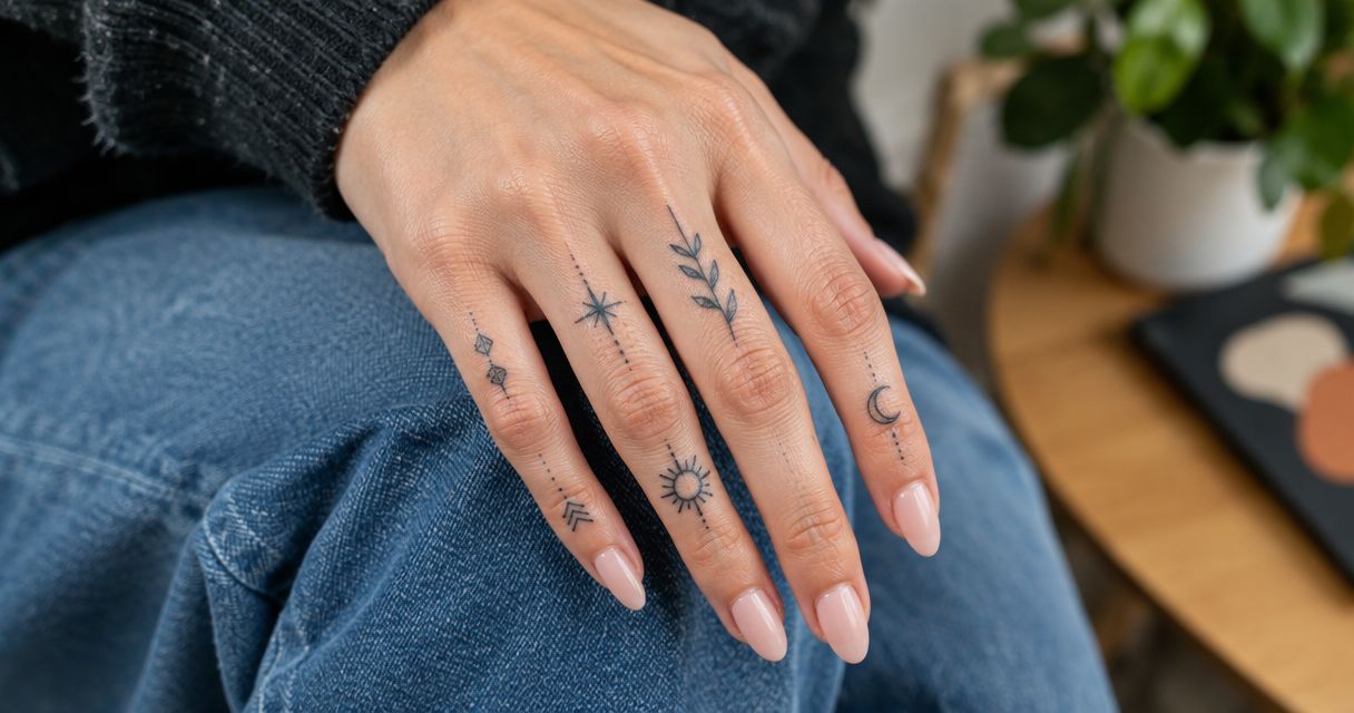
Best overall: a minimalist symbol. Best for personal meaning: a single initial. Best botanical option: a simplified stem. These finger tattoo design ideas for 2026 compare nine directions you can discuss with Illuminati Tattoo Co., with clear trade-offs for detail, placement, and everyday visibility.
- For finger tattoo design ideas, a minimalist symbol is the strongest default: one recognizable shape without crowded detail.
- Single initials suit personal meaning; botanical stems suit a design that follows the finger’s length.
- Finger tattoos need realistic expectations about fading, touch-ups, visibility, and the limits of tiny lettering.
- Illuminati Tattoo Co. offers custom tattoo design in Las Vegas for clients seeking artwork built around them.
Why this matters
A finger gives you a narrow, moving surface, not a miniature version of a forearm. A design that looks clear when enlarged on a screen can become cramped when drawn at its actual size.
Finger tattoos also deserve a direct conversation about wear. Frequent hand use, friction, and placement affect how the tattoo holds its appearance; no design makes those considerations disappear.
For your 2026 shortlist, start with the shape you want to recognize—not the smallest size you can request. Then let the artist assess whether the finger gives that shape enough room.
What makes the best finger tattoo design ideas?
- Readable silhouette: The main shape remains understandable without tiny interior details.
- Open spacing: Lines, letters, and separate elements have room between them.
- Placement fit: The composition works with the chosen finger and its natural movement.
- Personal relevance: The meaning belongs to you rather than depending on a passing trend.
- Realistic maintenance: You accept that finger placement requires a discussion about fading and touch-ups.
- Everyday visibility: You are comfortable seeing the design during work, photographs, and ordinary activities.
These criteria guide this 2026 ranking. A design earns its position through clarity and a distinct purpose, not because it contains more detail.
Finger tattoo designs at a glance
| Rank and design | Best for | Standout feature | Key limitation |
|---|---|---|---|
| 1. Minimalist symbol | An undecided first choice | Recognizable outline | Meaning depends on the chosen symbol |
| 2. Single initial | Personal dedication | Direct connection to a person | Small lettering needs careful spacing |
| 3. Botanical stem | A lengthwise composition | Follows the finger’s shape | Leaf detail quickly becomes crowded |
| 4. Open heart | An understated matching design | Clear shared motif | Familiar rather than highly distinctive |
| 5. Crescent moon | Celestial imagery | Strong curved silhouette | Tiny interior accents compete for space |
| 6. Geometric marks | A modular arrangement | Separate shapes create rhythm | Alignment changes with hand position |
| 7. Short word | A readable personal reminder | Meaning is explicit | Lettering demands more room |
| 8. Ring band | A jewelry-inspired statement | Encircling composition | Full wraparound placement needs assessment |
| 9. Small ornamental motif | A decorative focal point | Symmetry without a written message | Dense ornament loses clarity at small scale |
1. Minimalist symbol: best for an undecided first choice
A minimalist symbol uses a recognizable outline, such as a lightning bolt or simple wave. It gives you a clear starting point without asking the finger to carry a detailed illustration.
Keep the interior open. If the shape needs shading, lettering, and decorative dots to make sense, simplify it before choosing the size.
Minimalist symbol pros:
- Easy to discuss through a clear reference.
- Adaptable to different orientations.
- Does not require a long written explanation.
Minimalist symbol cons:
- A common shape offers limited uniqueness.
- A simple design still shows uneven spacing.
Best for: Someone who wants a clear, compact mark rather than a miniature scene.
Verdict: Buy. Choose this direction when you want the most straightforward starting point for a custom finger tattoo.
2. Single initial: best for a personal dedication
A single initial connects the tattoo to a person without fitting a full name onto the finger. Start with a plainly drawn letter before considering script or decorative flourishes.
Compare 2 lettering styles at actual size: a simple printed letter and a restrained script letter. Choose the version whose identity stays clear without explanation.
Single initial pros:
- Carries a specific personal connection.
- Requires less text than a name.
- Works as an individual or shared concept.
Single initial cons:
- Decorative loops consume limited space.
- Some letterforms look similar when reduced.
Best for: A dedication to someone whose initial has lasting meaning to you.
Verdict: Buy. Favor a recognizable letter over an elaborate monogram, especially when the available area is narrow.
3. Botanical stem: best for a lengthwise composition
A simplified stem places a central line along the finger, with a restrained arrangement of leaves or petals. Its vertical structure makes the direction of the design easy to understand.
Choose the plant for its shape as well as its meaning. A detailed flower reference needs reinterpretation, not simply reduction, to become suitable finger artwork.
Botanical stem pros:
- Follows the finger’s long shape.
- Allows a personal plant reference.
- Creates movement without written text.
Botanical stem cons:
- Closely packed leaves reduce open space.
- Botanical realism needs more room than an outline.
Best for: Someone who prefers organic lines to lettering or geometric marks.
Verdict: Buy. Choose a simplified stem if the overall silhouette matters more to you than exact botanical detail.
4. Open heart: best for an understated matching design
An open heart communicates affection through an outline rather than shading. It works as a shared design because each person can recognize the same motif without needing identical hands or placements.
Agree on the meaning first. Then let each person assess the size and location independently rather than forcing an exact copy.
Open heart pros:
- Immediately recognizable.
- Suitable for a shared concept.
- Does not depend on lettering.
Open heart cons:
- The motif is widely used.
- A very narrow center crowds the outline.
Best for: Partners, friends, or relatives who want matching symbolism without names.
Verdict: Buy. Choose the heart for its shared meaning, not because matching tattoos must look identical in every detail.
5. Crescent moon: best for celestial imagery
A crescent moon gives celestial artwork a distinct silhouette without needing a full sky scene. The main design decision is the relationship between its outer curve and inner opening.
Resist adding a miniature constellation simply to fill nearby space. The moon should remain readable on its own before any companion mark enters the composition.
Crescent moon pros:
- Recognizable curved shape.
- Clear orientation choices.
- Works without shading or text.
Crescent moon cons:
- An overly thin crescent sacrifices definition.
- Extra stars compete for limited space.
Best for: Someone drawn to celestial imagery who wants a single focal point.
Verdict: Buy. Keep the crescent as the main subject rather than shrinking an entire celestial composition onto the finger.
6. Geometric marks: best for a modular arrangement
Separate dots, short lines, or open shapes create a design through repetition. Unlike a continuous illustration, this approach lets empty space become part of the composition.
Review the arrangement with your fingers relaxed and extended. A pattern that looks aligned in a posed photograph does not stay fixed as your hand moves.
Geometric marks pros:
- Offers a clear repeated structure.
- Makes deliberate use of empty space.
- Avoids the demands of small lettering.
Geometric marks cons:
- Small alignment differences remain visible.
- Closely grouped marks become visually crowded.
Best for: Someone who values pattern and balance more than a literal image.
Verdict: Buy. Choose geometric marks when you like the arrangement in ordinary hand positions, not just a carefully staged pose.
7. Short word: best for a direct personal reminder
A short word makes the meaning explicit. It also asks more of the available space because each letter must remain distinct from its neighbors.
Decide whether you want the word to read toward you or toward someone facing you. Discuss that choice before placement; orientation is part of the design, not a finishing detail.
Short word pros:
- States the intended message directly.
- Supports personally meaningful language.
- Offers a choice of reading direction.
Short word cons:
- Letter spacing limits the usable size.
- Side placement adds friction considerations.
Best for: Someone who values the exact word more than a decorative symbol.
Verdict: Hold. Proceed only after the artist confirms that the lettering works at the proposed size and location.
8. Ring band: best for a jewelry-inspired statement
A tattooed band uses the visual language of a ring. The key distinction is whether you want a mark across the visible top of the finger or a design that continues around it.
Do not assume those placements are interchangeable. Ask the artist to assess the sides and underside separately and explain the maintenance implications before committing to a continuous band.
Ring band pros:
- Creates a direct jewelry reference.
- Offers a clear commitment symbol.
- Does not require a detailed picture.
Ring band cons:
- A continuous wrap crosses different finger surfaces.
- Straight, even-looking edges demand careful planning.
Best for: Someone who specifically wants a ring-inspired composition rather than a small standalone icon.
Verdict: Hold. Resolve the placement and maintenance questions before deciding how far the band should extend.
9. Small ornamental motif: best for a decorative focal point
An ornamental motif uses symmetry, curves, or a simplified flourish without requiring a written message. Think of a small decorative centerpiece rather than a compressed lace pattern.
Choose a dominant outline and remove details that compete with it. The motif should still feel complete when you take away its smallest accents.
Small ornamental motif pros:
- Offers decoration without lettering.
- Supports a balanced central composition.
- Gives the artist room to develop a custom shape.
Small ornamental motif cons:
- Dense interiors crowd quickly.
- Fine symmetry leaves little room for visual distraction.
Best for: Someone who wants ornament rather than a name, object, or relationship symbol.
Verdict: Buy. Choose a simplified custom motif, not a miniature copy of a detailed hand-tattoo reference.
How these designs are ranked
This 2026 guide prioritizes recognizable shapes, open spacing, placement fit, and distinct uses. The ranking is a design decision aid, not a claim that one motif heals better or lasts longer than every alternative.
The minimalist symbol leads because it is the simplest default to discuss. Lettering and wraparound bands sit lower because their appeal depends more heavily on resolving placement-specific limitations.
Turn your shortlist into a custom design
Bring 3 reference images that show the shape, lettering, or mood you like. Explain what you would change in each rather than asking the artist to copy another person’s tattoo.
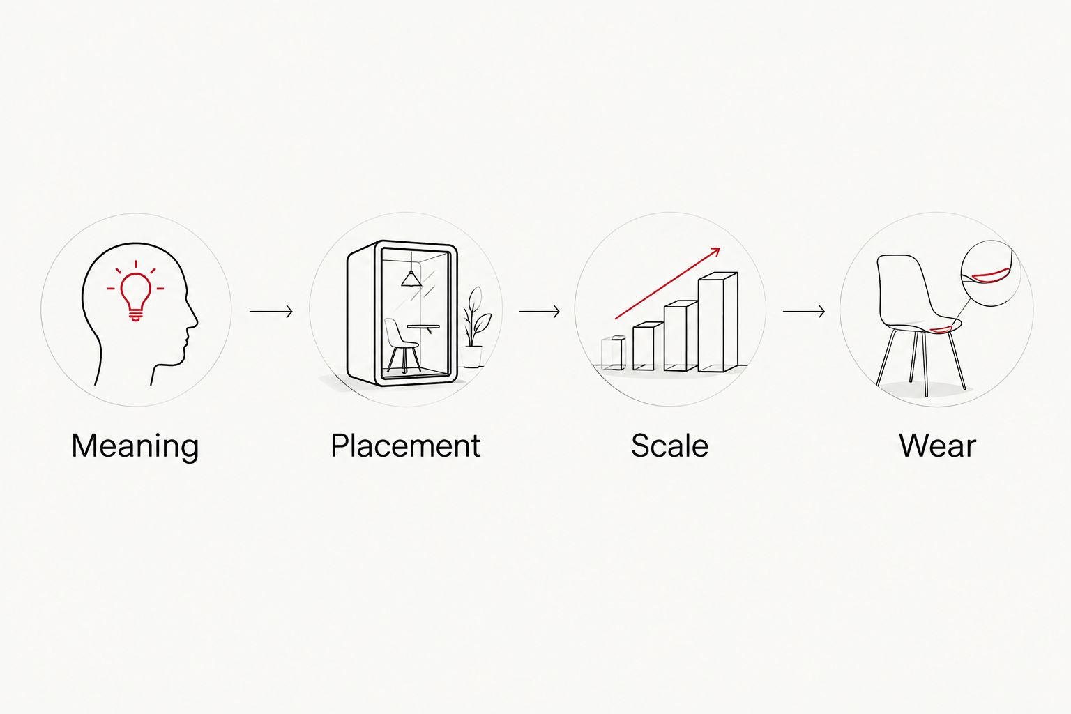
Build your 2026 consultation around these decisions:
- Meaning: Identify what the design represents.
- Placement: Select the finger and the surface you want assessed.
- Scale: Review the artwork at actual size.
- Wear: Discuss hand use, aftercare, and touch-up expectations.
Review the proposed placement in 2 hand positions: relaxed and extended. Check the orientation yourself rather than relying only on a photograph taken from the artist’s viewpoint.
Illuminati Tattoo Co. offers custom tattoo design and fine line work in Las Vegas, with owner-operated service and an emphasis on a clean, hygienic studio. Use the contact page to plan your visit and get directions; discuss your finger placement rather than assuming the reference is suitable unchanged.
Plan your studio visit
Discuss a custom finger tattoo, placement, and design choices in Las Vegas.
Which finger tattoo should you choose?
Choose a minimalist symbol if you are undecided. Choose an initial for a dedication, a botanical stem for an organic lengthwise design, or a short word only when the lettering has enough room.
Illuminati Tattoo Co. is best for Las Vegas clients seeking custom tattoo design built around their own references and placement goals. Your final choice should reflect the artist’s assessment, not just the order of this list.
FAQ
What are the best finger tattoo design ideas for a first tattoo?
A minimalist symbol, single initial, or open heart gives you a clear starting point. Keep the shape recognizable and ask the artist to assess the proposed placement before choosing a final size.
Do finger tattoos fade?
Finger tattoos can fade and develop uneven areas. Friction, hand use, placement, and healing affect the result, so discuss touch-up expectations before getting tattooed.
Is the side of a finger a good place for lettering?
Side-of-finger lettering needs a careful placement assessment. Limited space and friction make it important to review letter spacing and realistic maintenance expectations with the artist.
Are finger tattoos pain-free because they are small?
No, a small finger tattoo is not pain-free. Pain varies by person and placement; small artwork does not guarantee an easy sensation.
Should a finger tattoo face me or face outward?
Choose the reading direction according to how you want to experience the tattoo. Review both orientations at actual size before approving lettering or a directional symbol.
Can matching finger tattoos use different placements?
Yes, matching finger tattoos can share a motif without using identical placements. Each person should assess the design against their own finger shape, visibility preferences, and artist’s advice.
Where can I discuss a custom finger tattoo in Las Vegas?
Illuminati Tattoo Co. offers custom tattoo design and fine line work in Las Vegas. Bring references and ask the studio to assess your finger placement, design scale, and aftercare needs.
One last thing
Before approving your 2026 design, cover the reference image and describe the tattoo in one sentence. If your description depends on details you cannot clearly see at actual size, simplify the design—or give it more room elsewhere on the body.
A meaningful tattoo does not need every part of its meaning drawn into it. Let the central shape carry the idea.